Study Introduction
Over the past six weeks, I have been involved in a research project focused on Denny’s user experience. And yes, I know what you are probably thinking, the diner with pancakes and coffee, but this Denny’s is something completely different…
Denny’s is a small boutique brand offering clothing for kids, tweens, and teens, with locations in New York, New Jersey, and Florida. When I first explored their website, I was struck by how much information was packed onto the homepage. It felt a little overwhelming, but everything seemed purposeful and well-organized. Nothing appeared out of place, and all of the content seemed relevant to the user.
That said, I became intrigued by how the site’s layout and structure shaped the way visitors navigated and interacted with it, and whether the abundance of information helped or hindered the overall user experience.
While I have recently experimented with many other UX research techniques, including card sort activities and heuristic evaluations, nothing has given me as much insight as watching real people navigate the site through assigned tasks. Seeing users interact with the site in real time allowed me to notice where things felt intuitive, where they paused or backtracked, and how the overall experience matched or did not match their expectations.
This hands-on approach is exactly what usability testing is all about. Usability testing is a research method that evaluates how easy and intuitive a website or product is by observing real users complete real tasks. According to Experience UX’s guide to usability testing, it is one of the most effective ways to uncover pain points, identify confusing navigation, and understand how a design performs in practice.
Background & Tasks
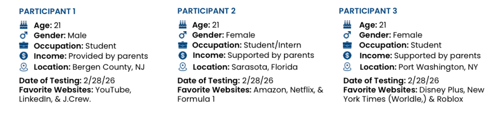
In my study of the Denny’s Clothing website, I conducted usability testing by asking three participants to complete specific tasks while thinking aloud. I recorded both their screen interactions and their commentary, which gave me a clear picture of how users approached navigation, interpreted content, and where they ran into friction. Watching users in action revealed patterns and insights that would have been impossible to capture through analytics alone and formed a much better foundation for recommendations to make the site more intuitive and user-friendly.
Participants were asked to complete five tasks that reflected real shopping behaviors. They were given specific prompts that navigated them through Denny’s different website pages. These tasks were designed to reveal usability strengths and areas for improvement:
- Locate the “About Us” page
- Find a small-sized item in the girls department
- Find a product in New Arrivals
- Find the shipping and return information
- Find the page that shows store locations
Not only did the results reveal how users’ mental models influence how they navigate the Denny’s website, but they also highlighted a number of mistakes, misunderstandings, and friction points that could slow or frustrate shoppers. Watching participants in real time made it clear where users’ expectations matched the website’s structure and where they did not.
Results & Observations
Each task highlighted specific behaviors and patterns that help explain how the site performs in real-world scenarios.
Task 1: Finding the About Us Page
For the first task, participants were asked to locate the About Us page to learn more about the company’s history and values. All three participants followed very similar navigation patterns. Each person immediately focused on the main navigation, particularly the upper portion of the screen. They clicked through areas such as the user login and account icons, expecting to find company information within the primary menu.
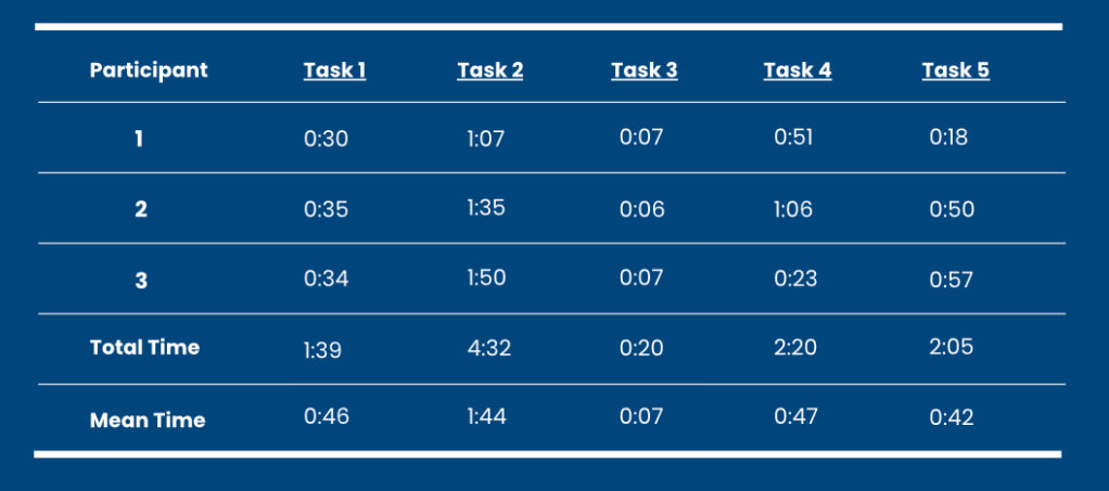
When they did not find it there, participants began scrolling down the homepage. They were then able to locate the About Us link in the footer relatively quickly. Although completion times were similar and overall task success was high, the brief hesitation at the beginning revealed a mismatch between user expectations and the site’s structure.
This suggests that users expect company and brand information to be accessible through the main navigation rather than hidden in the footer. Making the About Us section more visible could improve confidence and reduce the time needed to locate important brand information.
Task 2: Finding a Crewneck Sweatshirt in Size Small
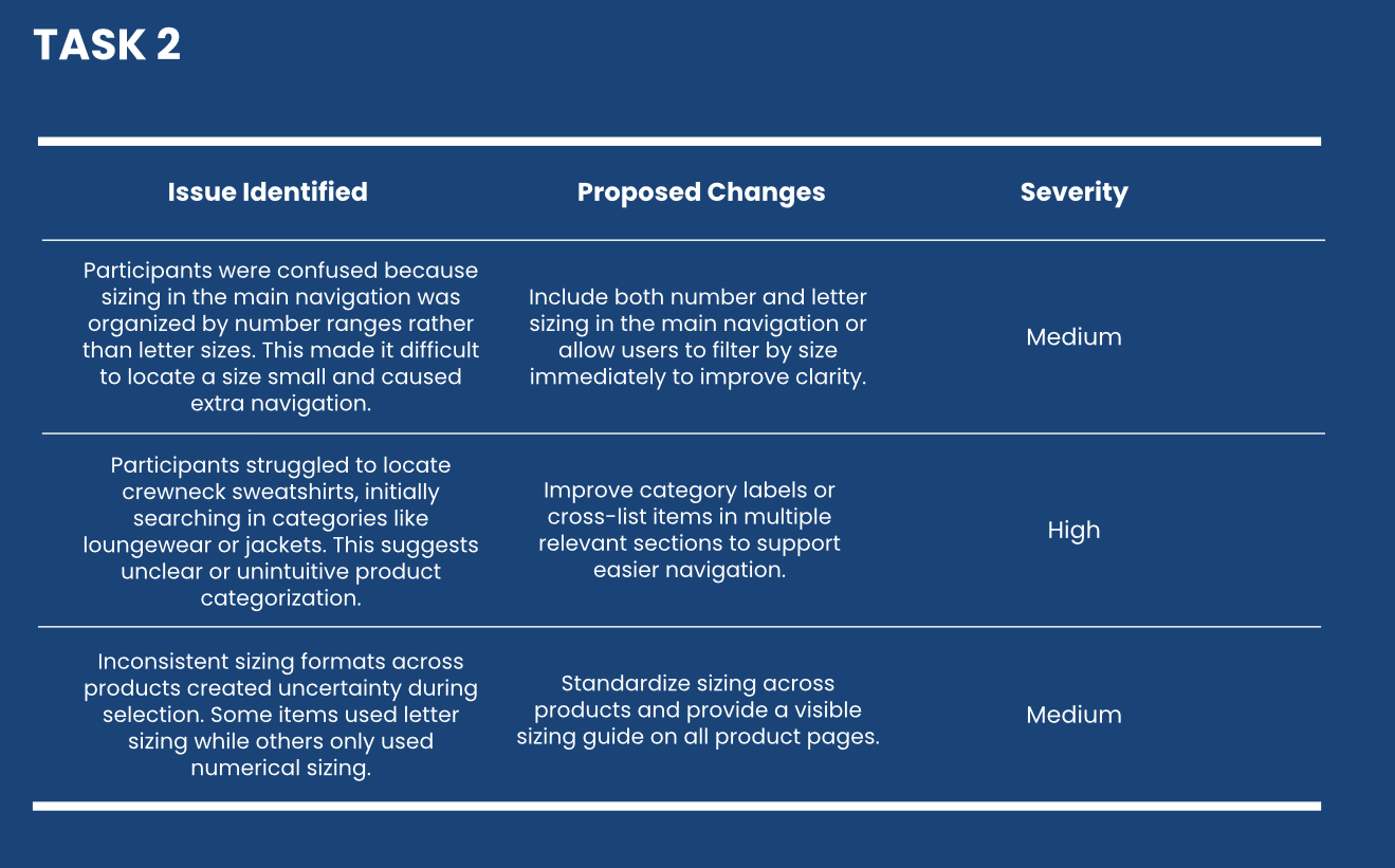
This task created the most challenges and had the longest completion times across all participants. The main issue centered around sizing and product categorization. Participants were asked to find a sweatshirt in a girl’s small, but the site’s navigation categorized sizing by numbers rather than traditional letter sizes.
For users unfamiliar with this system, it was not clear which numeric range corresponded to a “small.” This caused repeated clicks, backtracking, and uncertainty before participants identified the correct section.
In addition, participants struggled to determine where sweatshirts or crewnecks would be located. Some initially searched under loungewear, while others explored jackets before eventually finding the correct category under tops. This shows that product categorization did not always match user expectations.
Even after reaching the sweatshirt section, confusion continued because sizing formats varied by product. Some items used letter sizing while others used numerical sizing. The absence of a clear and visible sizing guide increased uncertainty and slowed decision-making.
Task 3: Locating Shipping and Return Information
This was the fastest and most efficient task. All participants completed it quickly and confidently, with an average time of about seven seconds. Each participant immediately scrolled to the bottom of the homepage and found the correct link in the footer without hesitation.
One reason this task felt so smooth is that participants had already explored the footer during the first task. As a result, they were more familiar with where informational content was located.
Although the information was easy to find once users knew where to look, it is currently only accessible in the footer. This may reduce visibility for first-time visitors who expect important customer service details to be easier to access. However, adding more links to the homepage could also contribute to the clutter that participants already noticed. Because of this, any improvements should focus on balance and visibility without overwhelming the layout.
Task 4: Browsing New Arrivals
Participants were able to locate the New Arrivals section fairly quickly, but some confusion arose during browsing. The homepage navigation clearly separates Men’s and Women’s categories, so participants expected adult clothing to be categorized under Women’s. However, many items were labeled as Juniors, which created uncertainty about whether the products were intended for adults or younger shoppers.
Some participants initially struggled to locate the correct department within the filters, and others navigated back to the main menu to confirm they were in the right section. Although they eventually found items and checked sizing availability, the inconsistent labeling slowed their experience and created hesitation.
This task revealed that clearer and more consistent labeling could improve confidence and help users feel more certain about where they are browsing.
Task 5: Finding the Nearest Store Location
Participants had mixed experiences when completing this task. All were able to locate the store locator within about 10 to 15 seconds, but they used different navigation paths. Some found the link in the main navigation, while others returned to the footer because they had already used it in previous tasks.
While participants in the Northeast were able to identify nearby locations without difficulty, one participant experienced significant challenges when searching in Florida. When entering her address or searching by state, the system failed to display results even though a store location existed. This inconsistency created frustration and uncertainty.
The issue appeared to be related to the store locator’s search functionality, which did not always produce accurate or reliable results. This is a critical usability concern because users rely on location tools to make purchasing decisions, especially when planning in store visits.
Recommendations for Improvement
Based on the usability testing results, several key areas stood out as opportunities to strengthen the overall user experience.
One of the most important improvements involves making key informational pages more visible. Participants consistently expected to find pages such as About Us and store locations within the main navigation rather than in the footer. Introducing these links in the primary menu or adding quick access sections could help users find important information faster and build trust in the brand.
Another major area for improvement is clarifying sizing and product organization. The use of numerical sizing instead of traditional letter sizing caused confusion and slowed task completion. Providing a clear sizing guide that displays both number and letter equivalents and maintaining consistent sizing formats across products would reduce uncertainty and create a more seamless shopping experience.
In addition, refining product categories and labeling would help align the site with user mental models. Participants often searched in unexpected categories because labels did not always match their assumptions. Updating terminology and clarifying categories would reduce unnecessary clicks and improve product discovery.
The testing also revealed the need to improve the store locator’s reliability. Because this tool plays a critical role in connecting the digital and physical shopping experience, ensuring accurate and consistent results should be a priority. Enhancing the search functionality and location filtering would improve user confidence and reduce frustration.
Finally, maintaining a balance between visibility and simplicity will be essential. While adding more links and information could improve accessibility, it is important not to overwhelm users with clutter. Strategic placement and thoughtful hierarchy will help preserve the site’s clean and organized feel while making key information easier to find.
Concluding Thoughts
Usability testing provided a deeper and more realistic understanding of how real users interact with Denny’s website. While some of the previous research methods helped identify potential issues, observing participants in real time revealed behaviors, assumptions, and frustrations that could not have been predicted.
This experience reinforced the importance of designing with users, not just for them. Even small mismatches between a website’s structure and user expectations can create hesitation, reduce confidence, and impact the overall experience. At the same time, the testing showed that thoughtful design choices already support many aspects of the user journey.
Moving forward, these findings provide a clear direction for improving clarity, navigation, and consistency. More importantly, this project strengthened my understanding of how powerful usability testing can be in shaping meaningful and effective design decisions. As I continue developing my skills in user experience research and design, I will carry these insights with me, always prioritizing real user behavior as the foundation for creating intuitive and engaging digital experiences.

Leave a comment