
Online shopping experiences strongly influence how customers perceive a brand. When a website is easy to navigate and visually organized, users can quickly find products, browse confidently, and complete purchases. However, when information is difficult to locate or navigation becomes overwhelming, frustration can quickly replace engagement.
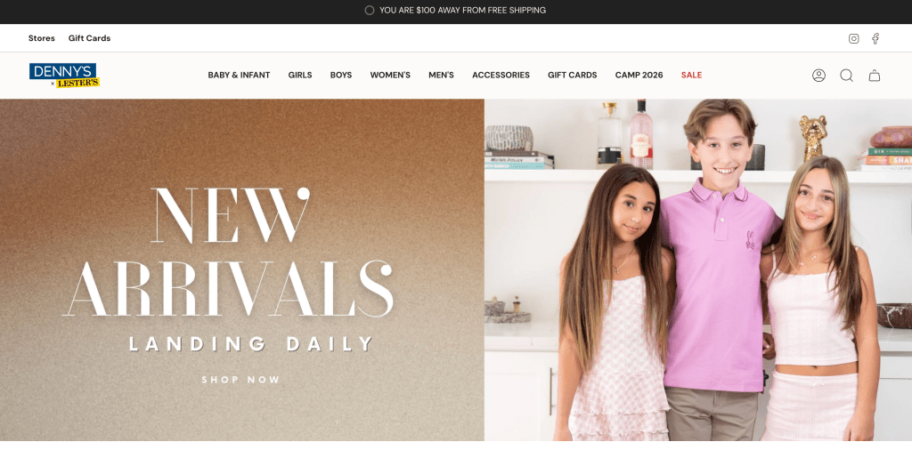
This UX research project analyzed Denny’s website, an online platform for browsing apparel, exploring promotions, and shopping for clothing. Through several UX research methods conducted over the past few months, the project evaluated how users interact with the website and identified opportunities to improve its usability, navigation, and visual clarity.
The goal of the research was to understand how effectively the website supports users as they browse products, locate information, make purchasing decisions, and recommend design improvements that create a more efficient and enjoyable shopping experience.
About the Brand
Denny’s Clothing is a family-focused apparel retailer that offers affordable clothing for children, teens, and young adults. The brand emphasizes practical, everyday fashion items, including school clothing, seasonal apparel, and accessories. In addition to its product selection, the retailer aims to provide a convenient shopping experience for families who need clothing that balances affordability, style, and accessibility.
The company operates several physical retail locations throughout New York, New Jersey, and Florida, serving communities where customers often shop for seasonal clothing, school outfits, and everyday essentials.
The website functions as the digital extension of the brand. It allows users to:
- Browse clothing collections
- Discover sales and seasonal promotions
- Locate store locations and hours
- Purchase items online
Because the website supports both online shopping and informational browsing, it plays an important role in shaping how customers interact with the brand.
Research Goals
The project aimed to evaluate the website’s overall usability and determine how effectively it supports users while browsing clothing online.
Several key questions guided the research:
- Can users easily navigate the website and locate products?
- What aspects of the site create confusion or hesitation?
- How do users typically browse clothing websites?
- What improvements could make the shopping experience more efficient?
Answering these questions required analyzing both user behavior and user perceptions, which led to the use of several UX research methods.
Research Methods
To develop a well-rounded understanding of the website experience, multiple UX research methods were used throughout the project. Each method provided a different perspective on user behavior, usability issues, and overall impressions of the website.
Usability Testing and Heuristic Evaluation
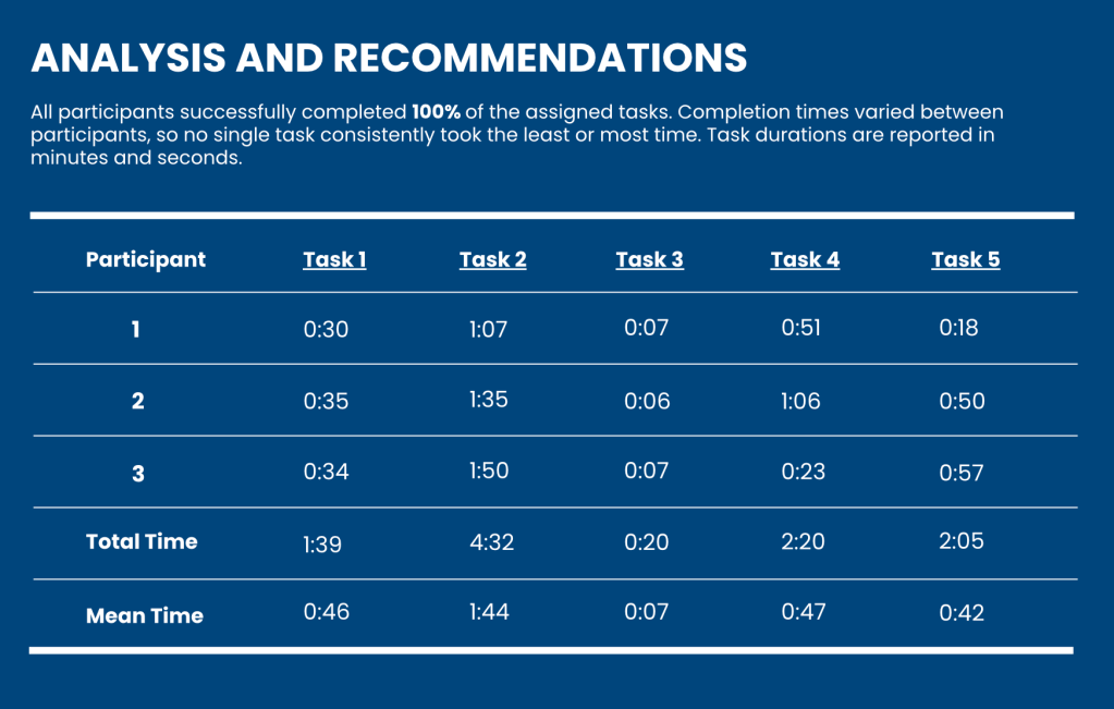
Usability testing observed how participants interacted with the website while completing realistic tasks such as locating clothing items, navigating categories, and finding promotions.
All participants were able to complete 100% of the assigned tasks, although completion times varied depending on the complexity of the task. Simpler tasks, such as finding return and shipping information, were completed quickly, while tasks involving sizing and category navigation required more time and caused hesitation.
A heuristic evaluation was also conducted using Jakob Nielsen’s usability principles. This evaluation examined the interface according to standards such as clarity, consistency, system feedback, and efficiency of use. The analysis identified issues including visual clutter on the homepage and limited filtering options when browsing products.
Card Sorting Study
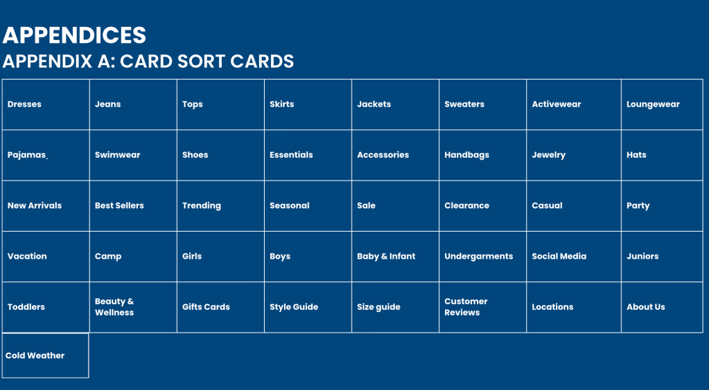
To understand how users expect clothing categories to be organized, a card sorting study was conducted.
Participants organized 41 different website items into categories that felt intuitive to them. Several patterns emerged:
- Core clothing items were consistently grouped together
- Age categories such as girls, boys, juniors, and toddlers were strongly associated
- Seasonal categories like camp and summer clothing frequently appeared
These results suggest that users naturally browse clothing by age group, clothing type, and seasonal purpose.
Surveys and Interviews
Surveys and interviews were developed as part of the research plan to better understand the behaviors, preferences, and experiences of potential users of the website.
The survey was designed to collect information about user demographics, online shopping habits, and browsing preferences. Questions focused on topics such as how frequently users shop for clothing online, what factors influence purchasing decisions, and what features users value most when browsing apparel websites.
An interview guide was also created to explore users’ personal experiences with the website in greater depth. The interview questions focused on navigation, product discovery, and general impressions of the website’s design.
Although these studies were designed as part of the research process, data collection was not conducted during this phase of the project. The survey and interview frameworks instead serve as research tools that could be implemented in future studies to gather additional insights about user behavior and expectations.
Diary Study
A diary study framework was designed to observe how users interact with the website over time.
Participants would record their browsing behavior across multiple visits, documenting:
- Why they visited the website
- What navigation paths they followed
- Any confusion they encountered
- Overall impressions of the experience
This approach helps identify patterns that may not appear during a single usability testing session.
Key User Insights
Across the research studies, several consistent patterns emerged about how users browse clothing websites.
Efficiency is critical
Many users visiting the website are busy parents or shoppers who want to locate clothing quickly. They prefer clear navigation structures and easy access to product information.
Promotions influence browsing behavior
Because the retailer focuses on affordable clothing, users frequently visit the website to browse promotions and seasonal deals.
Navigation should match real-world shopping behavior
Users naturally browse clothing by age group, clothing type, or seasonal need, rather than scanning long lists of categories.
Visual clarity improves browsing
Participants frequently described the homepage as visually overwhelming, which made it harder to focus on specific products.
Key Usability Findings
Several usability challenges were identified during the research.
Homepage Clutter
The homepage contains numerous banners, promotions, and visual elements competing for attention. While promotions are valuable for retail websites, excessive content can make it difficult for users to focus on products.
Navigation Complexity
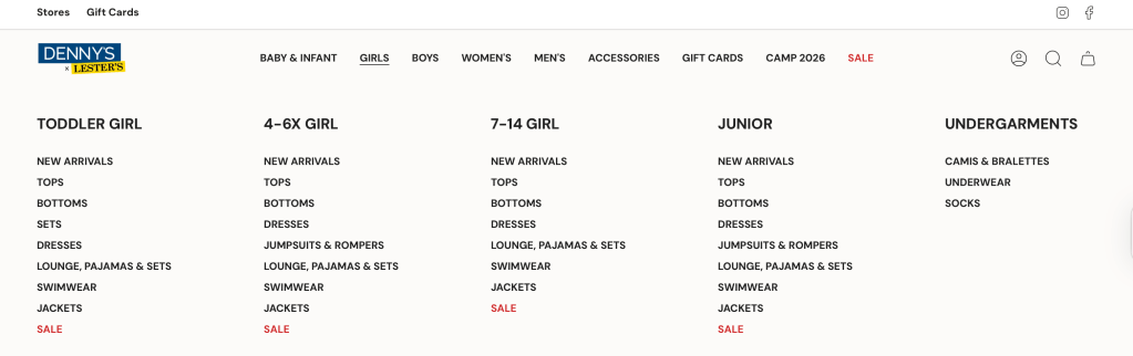
Large mega menus contain many dropdown options, requiring users to scan multiple sections before identifying the correct category.
Sizing Confusion
Numeric sizing categories and inconsistent product sizing formats created confusion when users attempted to locate specific sizes.
For example, selecting the “Women’s” section from the homepage redirects users to the same department as Juniors, displaying the exact same products. There is not actually a separate page dedicated to women’s clothing, which raises the question of why the category appears in the main navigation at all. This inconsistency becomes even more apparent when using the filtering options while browsing, where “Women’s” is not listed as a department.
As a result, the navigation creates an expectation that is not reflected in the site’s organization, leading to confusion for users trying to locate the correct section.
Information Placement
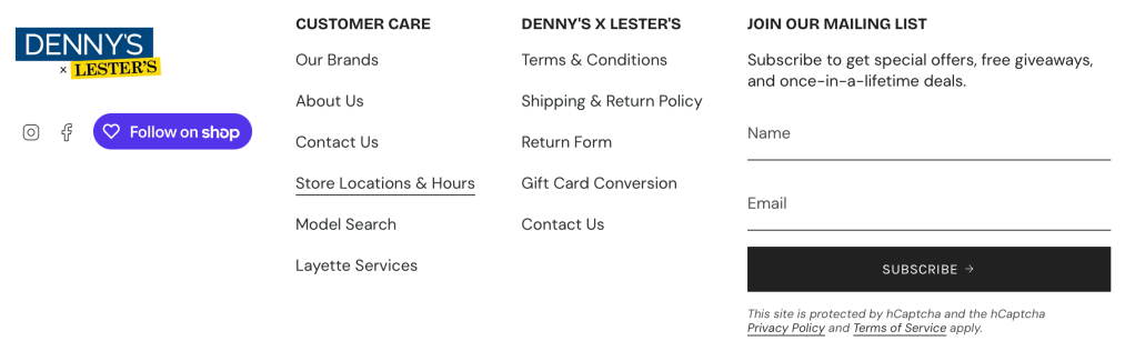
Important pages such as “About Us” and store location details are currently only accessible through the footer, which some users may overlook.
Recommendations
Based on the research findings, several design improvements could significantly enhance the website’s usability and effectiveness.
Simplify the Homepage Layout
Reducing the number of promotional banners and competing visual elements would make the homepage easier to scan. Creating a clearer visual hierarchy would help users immediately identify key sections such as featured products, promotions, and navigation options.
Prioritizing the most important information and minimizing visual clutter would improve readability and guide users toward their next action.
Improve Navigation Structure
Navigation should better reflect how users naturally browse clothing websites.
Organizing categories by age group, clothing type, and seasonal purpose would help users locate products more quickly. Simplifying dropdown menus and using clearer category labels could also reduce the amount of time users spend scanning navigation options.
These improvements would align the site’s information architecture with users’ mental models of how clothing categories are structured.
Strengthen Search and Filtering Features
Improving filtering tools would allow users to refine search results more efficiently.
Adding more specific and better organized filters for:
- Size
- Clothing type
- Price range
- Availability
This would help users narrow down product selections and reduce the time spent browsing large product lists.
Clarify Product Information
Providing clearer sizing guides, more detailed product descriptions, and consistent sizing systems across products would help users make purchasing decisions with greater confidence.
Enhanced product images and styling examples could also improve product discovery and help users better visualize how items fit or appear.
Final Takeaways
This UX research project highlights how thoughtful design improvements can significantly enhance the usability of an online retail experience.
While the Denny’s website successfully provides access to a wide selection of apparel and promotions, the research revealed opportunities to improve navigation clarity, reduce visual clutter, and streamline the browsing experience.
Implementing these improvements would create a more intuitive interface that supports users as they browse products, discover promotions, and complete purchases.
If you’re interested in viewing the full report, it will be linked below. Feel free to comment and give some feedback.

Leave a comment